
16.06.2026
Mobile First: smartphones first, then every other screen
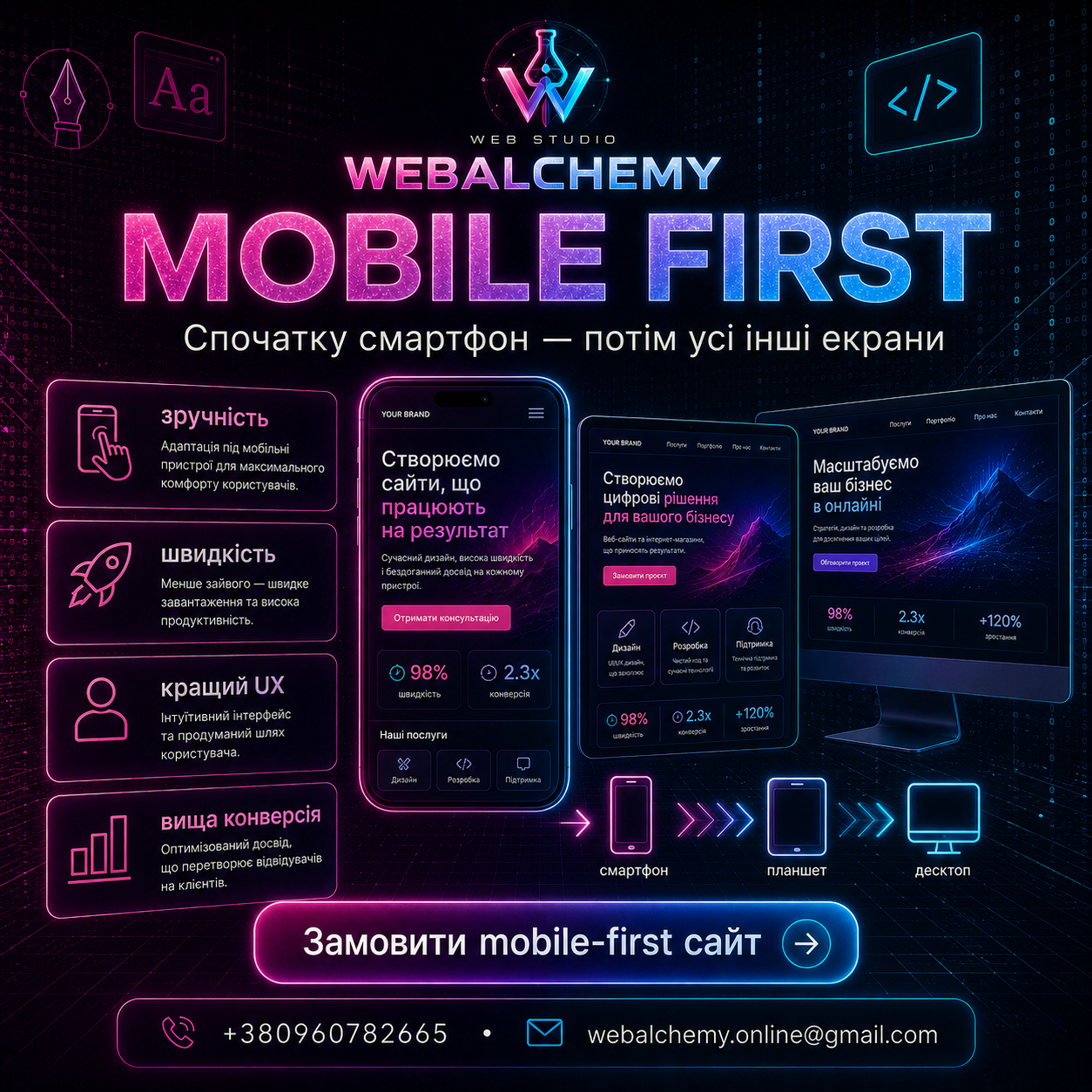
Mobile-first means designing the website for smartphones first, then scaling it to larger screens. This makes sense where most traffic comes from mobile devices.
Smartphones encourage design discipline
On a small screen, there is no room for excess. That is why mobile-first helps clarify the offer, remove noise, and keep only what matters.
Benefits of mobile-first
- ease of use for most users
- faster loading and fewer unnecessary elements
- better performance in mobile search
- easy scaling to tablet and desktop
When this matters most
Mobile-first is critical for landing pages, local services, e-commerce, social media advertising, and any niche where people make quick decisions on a smartphone.
Web Alchemy combines design, development, SEO, copywriting, video content, and automation to make the website a working sales tool, not just an attractive page.